The main update of the shirt logo is that the logo on the back of the shirt (right) has been made smaller and the logo on the front of the shirt (left) has been has been moved up and to the right by 1 pixel.
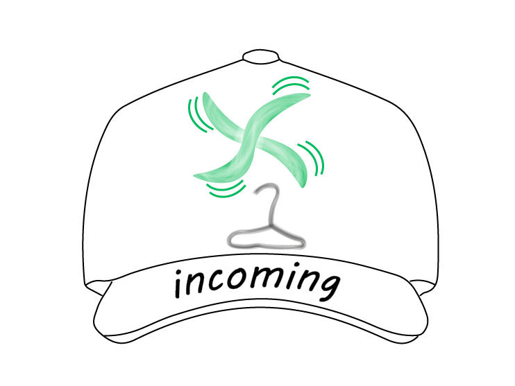
This image is of the same logo as before, however, there is 2 extra curved lines around the outside of the fan. This is used to give the fan an effect of moving.
This logo has changed colour on the fan and the contrast looks more defined. The colour was changed because the red was not visually pleasing and the green gives the logo a "green light means go" kind of feel.