Aperture: f/8
shutter speed: 1/250
ISO: 160

Date: 29/7/16
Time: 1:05 - 1:21 pm
Conditions: Sunny, no clouds.
Photoshop Adjustments:
+ Black and White effect
+ Straighten: -1 degree.
+ cropped so the basketball court isn't visible.
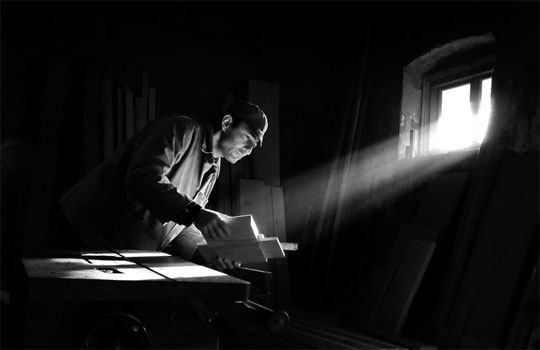
Analysis: This photo is of the wall on the Basketball courts, this was taken from a higher viewpoint that was achieved from climbing a tree. The sky was bright and was void of clouds. This was very important to the composition of the photo as this impacts on the strength of the shadows that were cast on the court. This photo sets a very gloomy feeling as a black and white filter was used
This photo is very bland as I used a black and white photo effect in the basic Windows photo editor, this reflects Max Dupain's style as the composition is of man-made architecture and uses dark features. This is a perfect display of the 30-60-10 rule as 10% is the bushes on the top left of the photo, 30% is the shadow and the bricks and 60% is the rest of the basketball court
30-60-10: This photo applies to the 30-60-10 rule as the bushes of the Ag farm on the top left. makes up 10% of the composition, The bricks and its shadow makes up 30% of the composition and the rest makes up 60%.
Leading Lines: The leading lines in this composition leads your eyes to the tip of the shadow, where there is the least amount of shadow.
Rule of thirds: The rule of thirds has the diagonal from the top left corner to the bottom left and an intersection cut from the top right to the middle of the photo. This splits the photo into 3 sections, the shadow and the bricks on one side, 2 halves of the basketball court.
--------------------------------------------------------------------------------------------------------------------------
Max Dupain style photo 2
--------------------------------------------------------------------------------------------------------------------------
Olive Cotton style photo 2
Aperture: f/5.6
Shutter Speed: 1/200
ISO: 200
Edits:
+ basic edits in Windows Photo Editor
+ Dark shadow Filter, 5th option on the basic Windows Photo Editor
Conditions: The conditions in the classroom were dark and the ISO was moved to 200 to compensate for dark conditions in the classroom.
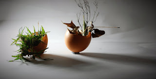
Analysis: This image is a pair of eggshells that were filled with dirt, leaves and grass from outside, then was mounted on some blu-tack stuck to the paper. The camera was taken front on, but at an angle and the eggshells were tilted so that the left was slightly in front of the other. The studio light source was placed behind the paper on the left so that the shadow looks like it jumps out at you, but the light from the source doesn't touch the viewer. Because the light source is far away from the subject, the shadows are more crisp and dark.
30-60-10: 30% = the gap after the right eggshell. 60% = both eggshells. 10% = the gap before the left eggshell. This creates an uneven composition as there is a significantly obvious gap after the right eggshell which is not equal to the gap before the left eggshell.
This photo is very bland as I used a black and white photo effect in the basic Windows photo editor, this reflects Max Dupain's style as the composition is of man-made architecture and uses dark features. This is a perfect display of the 30-60-10 rule as 10% is the bushes on the top left of the photo, 30% is the shadow and the bricks and 60% is the rest of the basketball court
30-60-10: This photo applies to the 30-60-10 rule as the bushes of the Ag farm on the top left. makes up 10% of the composition, The bricks and its shadow makes up 30% of the composition and the rest makes up 60%.
Leading Lines: The leading lines in this composition leads your eyes to the tip of the shadow, where there is the least amount of shadow.
Rule of thirds: The rule of thirds has the diagonal from the top left corner to the bottom left and an intersection cut from the top right to the middle of the photo. This splits the photo into 3 sections, the shadow and the bricks on one side, 2 halves of the basketball court.
--------------------------------------------------------------------------------------------------------------------------
Max Dupain style photo 2
Aperture: f/5.6
Photoshop Adjustments:
shutter speed: 1/200
ISO: 100

Date: 1/8/16
Time: 12:14 - 1:58 pm
Conditions: Sunny, some clouds, blocking sunlight.
Photoshop Adjustments:
+ Black and White Filter
+ Rotate 2 Degrees
+ cropped the trees out of the top of the photo.
+ Rotate 2 Degrees
+ cropped the trees out of the top of the photo.
Analysis: This photo is of the Liesse building from a high viewpoint, this I achieve by standing in the stairs in the Adrian building and taking the photo looking through the window. The main focal points of the composition are the two doors, I believe that they are the focal points as I am expecting someone to walk out of the doos. This is a very odd photo as it doesn't comply with the 30-60-10 rule. Nothing in the photo is in proportion and there are various leading lines no the rails, I don't think that it applies to the Rule of Thirds either.
30-60-10: The photo is not in proportion.
Leading Lines: The leading lines in this composition are deceptive as there are multiple on the railings on the staircase. There are railing that are tilted upwards and some that are tilted downwards.
Rule of thirds: I can't find any rule of thirds in this photo.
--------------------------------------------------------------------------------------------------------------------------
Olive Cotton style photo 2

Aperture: f/5.6
Shutter Speed: 1/200
ISO: 200
Edits:
+ basic edits in Windows Photo Editor
+ Dark shadow Filter, 5th option on the basic Windows Photo Editor
Conditions: The conditions in the classroom were dark and the ISO was moved to 200 to compensate for dark conditions in the classroom.
Analysis: This image is a pair of eggshells that were filled with dirt, leaves and grass from outside, then was mounted on some blu-tack stuck to the paper. The camera was taken front on, but at an angle and the eggshells were tilted so that the left was slightly in front of the other. The studio light source was placed behind the paper on the left so that the shadow looks like it jumps out at you, but the light from the source doesn't touch the viewer. Because the light source is far away from the subject, the shadows are more crisp and dark.
30-60-10: 30% = the gap after the right eggshell. 60% = both eggshells. 10% = the gap before the left eggshell. This creates an uneven composition as there is a significantly obvious gap after the right eggshell which is not equal to the gap before the left eggshell.


